PhotoPhile – an iPad App for Lightroom
You’ve just come back from holiday/photoshoot/visit to grandkids/(insert reason for taking photographs here). All photos transferred, and ready to go. All you need to do now is sit in front of your workstation for hours, classifying, keywording and doing all the other similar things that you need to do if any of Lightroom’s sorting and filtering features have any chance of working.
Wouldn’t it be nice if you could do this somewhere more comfortable? How about if you could sit in front of the fire with something nice and tactile… say like an iPad… and do all the captioning, labelling, starring and rejecting there instead?
That would need an App, though. Well, now there is: PhotoPhile.
Here’s the basic list of features:
- Sync photos and data both to and from Lightroom, directly inside Lightroom.
- Change star ratings, labels, captions, comments and flags on your iPad
- Sort and filter photos on your iPad just like in Lightroom’s Library module
- Use the same controls on the photos in your iPad’s Photos App
This article is one of two about how to use this app, and this one focuses on editing your photos’ data. The other will have more of a business-oriented focus.
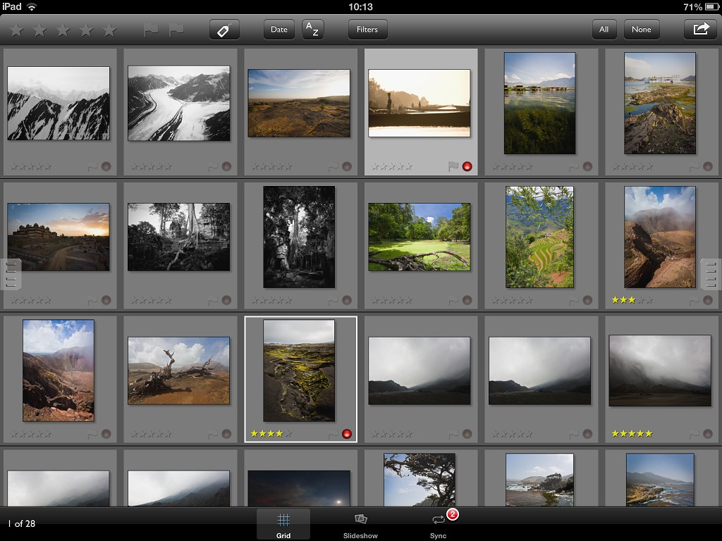
PhotoPhile Grid Page
So how does this work?
Well, you need to download and install the App. Duh. It’s free to install – with a few limitations which you can pay to remove – so there’s nothing to lose by trying it out. There’s a few photos installed along with it so you can play with it immediately, but that’s not much use for your own photos. You can choose to buy a couple of options which remove the limitations and add more options. Next you need to install a Lightroom plugin which lets Lightroom talk to the App. Tricky? Nah – the plugin is included with the App. If you visit the “Sync” tab in PhotoPhile, you’ll see a download location. Download the Lightroom plugin from that location, install it as you usually would (overview here if you’ve never done it before) and you’re off.
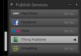
Lightroom’s Publish Panel
What you have now is a new Publish capability in Lightroom. In the Library module, on the left-hand side, scroll down until you see the “Publish Services”, and you should see one called “iThing Publisher”. Click on the little “+” icon to the right of the “Publish Services” header and you’ll get a menu; choose the “Set Up” item under the “iThing Publisher” heading.
From here you get a new dialog, much like the one you get when you’re exporting to hard-disk. The difference is that there’s a drop-down list on where you should get the name of your iPad appearing. If that doesn’t happen you might need to add “Bonjour” support if you’re on Windows and don’t have iTunes installed. If so, the plugin will tell you so and you can download and install Bonjour from Apple. Ignore the “Print Services” title, it’s not!
So… choose your iPad from the list. Click OK. You can now begin to share photos with your iPad directly.
OK, it’s installed. Now what?
Dead easy. Create a published collection and you can start dragging photos into it. This doesn’t affect anything else in your catalog, you’re not moving photos around, just adding them to a collection just like a normal Lightroom collection. The difference is in a couple of nearly-hidden buttons.
First, check to the top right of the grid; there’s a little button labelled “Publish”. If you click that – go on, try it – then, provided you have PhotoPhile running on your iPad, it will start whirring away and whatever photos you added to the Published Collection will start to appear. Easy as that.
To the iPad!
Right… hopefully you recognise a lot of what you’re seeing on the iPad. Make sure you’ve switched to the “Grid” tab and you should see all your published photos. OK, great… I’m sure you already have iPad photo publishing things, so what’s the difference here? Well, check the toolbar at the top and you’ll see stars, flags, a “label” button and various other controls. Pick a photo – tap it to select it, just like Lightroom – and then flag it as “Selected” using the flag icons on the toolbar. Not into flags? That’s fine, try a star rating instead.

PhotoPhile Toolbar
Beat that, “Photos” app!
So what can we do here? Let’s have a quick tour round, starting at the top left.
Stars and Flags
The stars are a rating system, simple as that. You like a photo? Give it five stars by tapping on the fifth star. Not so much? Okay, three stars – tap the middle star. You get the picture. No stars? You really hate your own photo that much? Easy, just tap whatever star rating it currently has to remove it completely. Go easy on yourself though, zero stars is harsh!
Next on the toolbar, to the right of the stars, are flags. These work largely as “Yes” and “No” markers; a white flag for “Yes”, a black flag for “No”. If you do use Lightroom, these map directly onto Lightroom’s flags. Just like the stars, all you need to do is tap the flag to set it and tap it again to remove it.
Labels
These are a little more involved. A label isn’t restricted to one value, or two, or five. You can set any word as a label. The key thing is that you can search using the labels later on. Usually they’re used as quick reminders; “Needs Work”, “Publish”, “The Cat”, things like that.
Tap the Label button and you get a list of all the labels that are assigned to the photos in the view. All you need to do to assign one is tap it, just like the stars and flags. Want a new one? No problem, you can do that too. Once again, if you’re a Lightroom user then these labels can be copied to and from the iPad too.
But what’s the point of adding all this stuff if you can’t use it? Well, you can, so let’s move on to…
Filtering
If you’ve not seen it yet, it might be worth a quick squint at the Filtering article for Lightroom; this part of this article goes much the same way. Once you’ve got some stars, flags and labels set you can filter on them. If your test photos have EXIF data embedded – camera, lens, capture time etc. – then you can filter on that too. Tap the Filter button and see what happens…
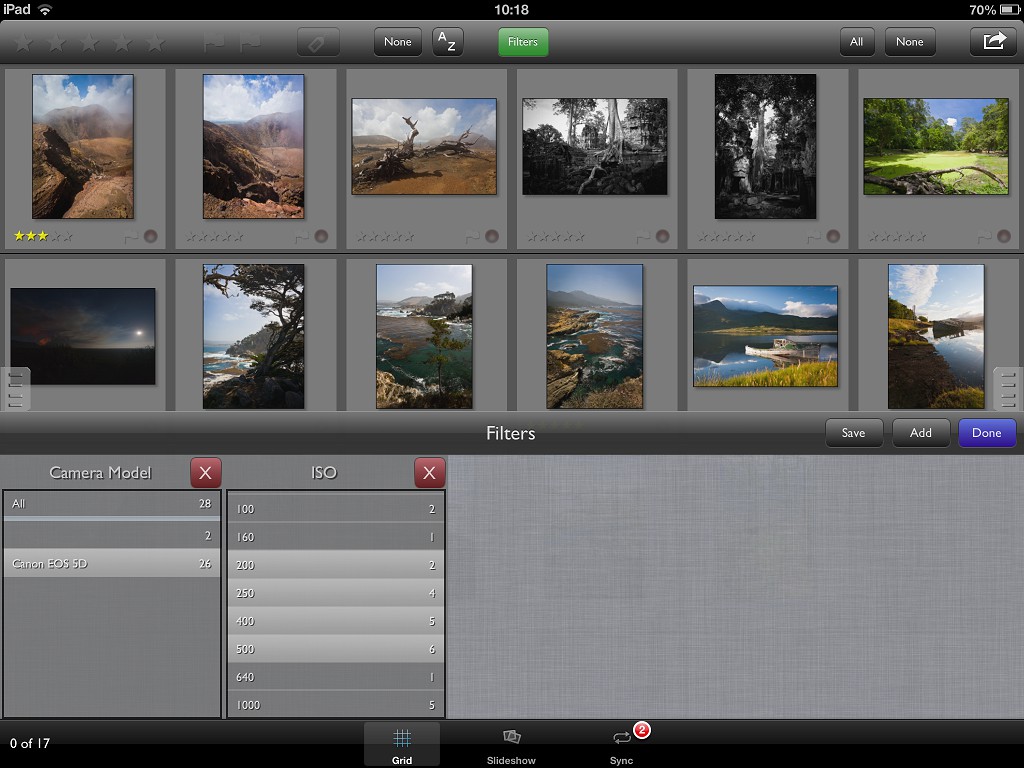
PhotoPhile Philter – sorry, Filter – bar
… a rather dull grey bar at the bottom of the screen. Oh.
No problem, let’s make it a bit more interesting. See the “Add” button in blue? Go ahead, try it. You’ll get a list of the available filters. Pick one appropriate for your photos; stars, date, whatever fits. That dull grey bar just got a little more interesting. Now you can filter on whatever you chose – pick something from the new list and see how the main display changes.
So, what’s all that spare grey space for? Well, see the “Add” button’s still there? Try it again. Well, yay – another filter, and it works together with the first one you added. Third? Fourth? No problem, just add as many as you want.
Let’s say you come up with a set of filters you’re likely to use again. All this “Add” – choose – “Add” – choose stuff takes time. PhotoPhile’s got that covered too; next to the “Add” button is a “Save” button. Tap that and the current set of filters get saved so you can re-use them later. Just add a name so you can find it again.
Find it where, I hear you ask? Patience, grasshopper…
More Space Needed!
We’re still short of a few controls here. It’s a problem on a small screen – how to get enough space to work while keeping all the controls? The answer? Extend the screen.
If you look to the left and right of the Grid screen there are little grey tabs. Drag the one on the left towards the center of the screen and you get a hidden panel appearing.
The Collections Panel
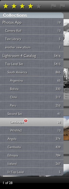
PhotoPhile Collections Panel
The top section is a simple list of all the groups of photos you have. Depending on where you got them from, they might be “Photos” app Albums or Lightroom “Published Collections”. Either way, you can see the photos in each of them by just tapping the name. Any filters you have work on the displayed photos only.
Beneath those groups is another set – Saved Filters. Remember that set of filters you saved off earlier on? You should see if shown here. Tap it and see what happens; the filter gets re-applied with all your settings intact. You might find that it also sets the displayed collection back to “everything”. If that’s not what you need – if you’d prefer that choosing a Saved Filter left the current collection alone – you can change this in the iPad’s “Settings” app, along with several other values.
One more quick point; tap the button to the right of the Saved Filter name and you get the option to rename or delete it.
The Information Panel
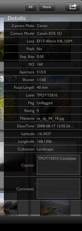
PhotoPhile Info Panel
Okay, that’s one “hidden” panel dealt with. How about the other? Look on the right of the grid screen and there’s another little grey tab. Pull that one out and you’ll see a simple panel which shows details of whichever photo or photos you have selected. Nice and simple. The only ‘usable’ controls on this panel are for entering comments and captions.
What happens if you select more than one photo? Depends on another setting. You can choose between showing only the common values across all selected photos, or only the details from the last photo you selected. Your choice.
So… those thousands of photos you have lurking around your iPad? Reckon you can find the one you want now?
The Slideshow
Got some photos selected in the Grid? Great. Now what?
Chances are you want to show them to someone. Okay, that’s easy. Tap the “All” button – toolbar, top right – and then the Slideshow tab. All the photos you selected are passed in and you can scroll through them by swiping, just like you’d expect. Tap to zoom, pinch to zoom and scroll around, all the normal iPaddy stuff. This slideshow has a couple of tricks up it’s sleeve though.
The Toolbar. Again.
Remember the toolbar from the Grid? Good, because that means I don’t need to describe the toolbar in the slideshow! You get the stars and flags again, and you can use them to rate and flag the current photo. Not enough detail in the grid to decide? No problem – come into the Slideshow and decide there.
There’s more tappy goodness in there too. You can change the captions here too, just hold a finger on the screen for a second or so and you’ll be able to make your changes.

PhotoPhile Slideshow Toolbar
So what’s extra on this toolbar? The “Previous” and “Play” buttons do what you might expect; previous and next photos. The “Play” button puts the slideshow into play mode. Once again, you can tinker with this in the Settings; in this case, the delay between photos.
And Finally…
The Sync tab. Most of the time you can ignore this, it’s got various bits of information about your iPad, network settings and the like. Really don’t need any of this most of the time, it’s only useful if you really want to keep track of exactly what’s going on.
Where you will find it useful is if you’re linking PhotoPhile with Lightroom. This was covered earlier on, but in summary you will find a URL on this page which lets you download the Lightroom plugin directly from your iPad. You should only need this once.
Syncing
Let’s assume you’re using Lightroom in conjunction with PhotoPhile, then. You’ve made a load of changes to star ratings, captions and the like (did you notice the ‘changed’ counts on the tab-bar, by the way?) and now you’d quite like to get those changes back to Lightroom. What now?
PhotoPhile listens to commands from Lightroom, so you need to trigger the sync from Lightroom. You can hit the “Publish” button on a published collection, or just pull the changes from PhotoPhile by using the “Sync” button at the bottom of the right-hand panel. It’s quite tricky to spot at first, it’s just a little “recycle” icon right at the bottom of the panel where it says “Comments”. Make sure your iPad’s on and running PhotoPhile and press the button; your changes get pulled back to Lightroom, the “Edited” light gets removed in PhotoPhile and everything’s equal.
So, with any luck you can find your way around PhotoPhile and get a grip on your photo collection. This isn’t just for filtering your photo collection though, you can do more with it if you put your mind to it. That’s for another article though.