Library Filters
The Library module has a wealth of tools that are only barely visible, and often overlooked. Watching people using it, many seem to organise things only using the folder list on the left; some use collections as well, but the filtering seems to be pretty much overlooked. I get a terrible case of back-seat-driver-itis watching people paging through hundreds of photos, or stabbing into one folder after another, trying to find some photo or other when all they need to do is think about filtering.
Let’s face it, you’ve probably got hundreds or more likely thousands of photos stored that you’re unlikely to use but don’t want to get rid of, just in case. Fair enough, I know I do. So let’s make life a little easier by using the tools that Adobe built in to narrow them down a bit!
That innocent-looking little grey bar is the filter bar. Well, one of them, but I’ll come back to that later. If it’s not there at all, check that you’re in “Grid” view – the filter bars only appear in the grid. Press “G”, or use the View menu, or the grid icon at the bottom left of the main display. If it’s still not there, check that it’s not switched off; press “\”, or make sure that the “Show Filter Bar” option is ticked on the “View” menu.
Those four words in the middle of the filter bar – “Text”, “Attribute”, “Metadata” and “None” hide a huge amount of power. Well, let’s call it three words then; “None” doesn’t have much in the way of hidden power, but it does have it’s uses. Round about now it’s worth a quick reminder that there’s not much in Lightroom’s interface that won’t squeak if it’s poked, so go ahead and poke at… the Metadata filter.
That’s the one that says “Metadata”. You knew that.
The Metadata Filter
The top of the grid display opens out into a number of lists. Which lists I can’t rightly say, because Lightroom remembers which ones you used last and I use these a lot so mine have all changed. In fact, that’s as good a place to start as any. At the top of the lists will be a heading, saying what that list contains. Go ahead, poke it; it squeaks.
So, do those headings look useful? Just so the rest of this article goes smoothly, choose “Camera” in the first list, Lens in the second, ISO Speed in the third and Shutter Speed in the fourth. Oh, and make sure you have a goodly selection of photos in your view too, there’s not much point in filtering when you can see the entire set on screen at once! If you want to prove a point, you can choose your entire catalog if you want. The filtering is pretty quick no matter how many photos you have visible.
Now, I have no idea what photos you have in your catalog so we might need to wing it a little here. I’m going to filter based on my catalog, you’ll just need to change things to match your own as we go along.
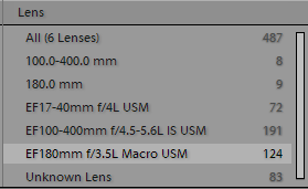
To start with, make sure that all four filters have the first item selected; this will say “All (something else)”, followed by a number. The number is how many photos match this filter. The grid should show exactly this number of photos too. Let’s narrow things down a little – this is supposed to be an article on filtering, after all. Pick a list which has more than one item in it and select it. In my case I’m going to filter on my macro lens by selecting the “EF180mm f/3.5L Macro USM” item in the “Lens” list:
Well, would you imagine taking a look at that! Now I only have 124 photos displayed, instead of 487, and every last one was taken with the macro. Yours will be different of course, but you get the picture. Let’s narrow it down even further and say that I only want anything that was taken at a shutter speed higher than 1/400. On this particular trip the leeches were pretty thick on the ground and even thicker in my socks, and hand-holding a 180mm macro lens in the jungle whilst weak with blood loss doesn’t work so well at lower shutter speeds. Take a look at the “Shutter Speed” list, which should be the last one on the right if you set things up the same way. I’m going to select the “1/250 sec” item:
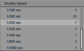
A single shutter speed filter
So far so good, except that we’ve now only got 7 photos shown and I wanted a bit more choice than this. Am I going to need to filter by each shutter speed one at a time and then try and remember which photos I liked? ‘Course not – hold down the Control or Command key and click on the “1/320 sec” item. It lights up at the same time as the “1/250 sec” item, and we’ve now got a whole 9 photos displayed. Knock yourself out and select some other shutter speeds, and bring in some more photos.
One more little trick for the “Metadata” filter is that you’re not limited to four columns. Hover your mouse pointer over the title of one of the lists; the heading should highlight, drawing your attention to it. Unfortunately it draws your attention away from a quiet little icon that appears on the other side of the bar:
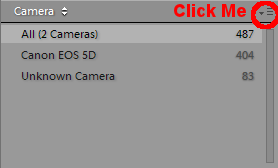
Add or remove columns using this drop-down
Click on this and you get a simple menu, giving you the option to “Add Column” or “Remove This Column”. I’ll leave you to work out those ones for yourself.
One final word – one of the most-often requested searches is for file type; people want to find all JPEGs, or all DNGs for example. One of the filters that is available is… drum roll… “File Type”.
Wait! Don’t go!
That was just the metadata filter! There’s more, much more!
The Text Filter
Try clicking the “Text” item in the filter bar. It should light up too, just like the “Metadata” filter does. In fact, the metadata filter stays lit even if you click the “Text” item, because you have a filter defined in there. It stays lit as a reminder that there’s something in there acting on your grid display.
The text filter has less options, but may often be of more direct use. You can only add one filter here, but it works on both metadata (i.e. the stuff your camera adds whether you like it or not), and the stuff that you’ve painstakingly added using Lightroom itself. Things like captions, keywords, copyright, headlines, dates, locations and stuff added by plugins. Because you’ve added these things yourself (you did caption and keyword, right?), they’re probably more useful for filtering than the raw nuts-and-bolts data that your camera knows about.
The text filter is simpler. There are only three options:
- What to search in.
- How to search it.
- What to search for.
The first is fairly intuitive. Click the drop-down and you get a list of things to search. Most of these should be fairly obvious, so let’s skip those and start with the “Searchable Metadata”. This searches a combination of IPTC and EXIF data.
What are those, I hear you cry?
IPTC is stuff relating to the content of the photo, and most of which you will probably have had to enter manually. If you’ve followed through the “Advanced Import” article, you might get some of this filled in automatically. Because it’s the photo content, there’s not really any way that the camera can do this for you; it will cover things like copyright, location, subject codes, model release data etc. More generally useful are the “Caption” and “Heading” fields.
EXIF is more techy data, things like the camera model and serial number, lens, flash and exposure details. In other words, things the camera definitely does know about and will fill in for you, whether you like it or not.
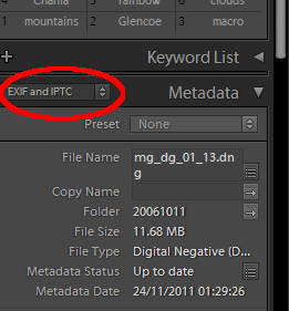
Pick some metadata, any metadata
If you want to see exactly what you can search on, use the Library module’s “Metadata” panel (on the right, and you might need to scroll a bit) to show you. If you look to the left of the “Metadata” heading there’s another drop-down; set this to “EXIF and IPTC”. Most of what is shown beneath is searchable in the Text Filter.
Moving swiftly back to the Text Filter at the top of the grid, the next two items on the drop-down list are “Searchable EXIF” and “Searchable IPTC”, which just narrows the search down a little more. Again, the Metadata panel has preset groups for EXIF and IPTC so it’s easy to see exactly what’s included.
Last is “Any Searchable Plug-in Field”. This one may or may not be useful, depending on which plugins you use. Some plugins might add their own data to the Lightroom database. Some of that data might be searchable. It really depends on the individual plug-in. Probably of more use is the first item in the drop-down – “Any Searchable Field” – which opens the search up to pretty much everything.
The next drop-down, to the right of the first, says how to search. Again, the options on here are pretty clear so I’ll skim over them, except to mention spaces. In this filter (and elsewhere), Lightroom treats spaces as if they meant “or”. This will be easier with an example, but of course you don’t have access to my catalog so you’ll have to bear with me. We’re going to leap boldly ahead and type some stuff into the last box here, but it’s still the second drop-down that’s relevant.
In my Madagascar photo collection, I have various photos of chameleons and lemurs, some of which also have the keywords “green” or “grey” (that’s “gray” for American readers, but if I spelled it that way then a) my example wouldn’t work, and b) it would just be plain wrong).
Temporarily ignoring the “how to search” drop-down, I’m going to enter “cham gre” in the text field, like this:
And to think that I’ve got the cheek to complain about spelling! Stay with me here, there’s a point, and it’s about the different ways to search that are in that second drop-down list. And those methods are:
Contains
This simply returns any photos which contain either the letters “cham”, or the letters “gre”, in any searchable field. In my case, I have keywords on the photos of “chameleon”, “grey” and “green”. Or, to put it another way, if I searched for “High altar”, I’d get any photos with “high” or “altar”, plus any which had a keyword or caption containing the phrase “high altar”. Or even if it contained “altar high”, or nothing more than “thighs” – the point is that it contains at least one of the words that I’m searching for, because Lightroom takes the space as separating items in a list.
Contains All
Much the same as the last, but the words in the list (“cham” and “gre”) must all be matched. So, “grey lemur” and “yellow chameleon” are gone but “green chameleon” remains.
Contains Words
This is probably closer to what you’d expect. It will return any photos which have any of the search terms (“cham”, “gre” remember) but they must be complete words, instead of just fragments of words. Which in this case is pretty useless, since neither of my search terms is a complete word. This can be useful, because if you’ve got a client sat beside you asking for photos of a high altar, they probably won’t be impressed by pictures of shapely thighs.
Doesn’t Contain
Works just like “Contains”, but backwards.
Whoa, there!
That was just the Text filter, there’s another one to go. Oh, go on then, take a break. I’ll wait.
The Attribute Filter
This is the last one, honest. Back on the filter bar, click the “Attribute” heading to show the attribute filter. Anything here look familiar? Let’s see:
Ok, there are four groups on here. First are the flags; three states representing “Flagged”, “Not Flagged” and “Rejected”. If you haven’t come across these yet, they’re worth knowing so check out the “Grouping Photos” article later on. For now, just bear in mind that Lightroom gives you a whole stack of ways of marking photos so that they’re easier to find, and this is one of them.
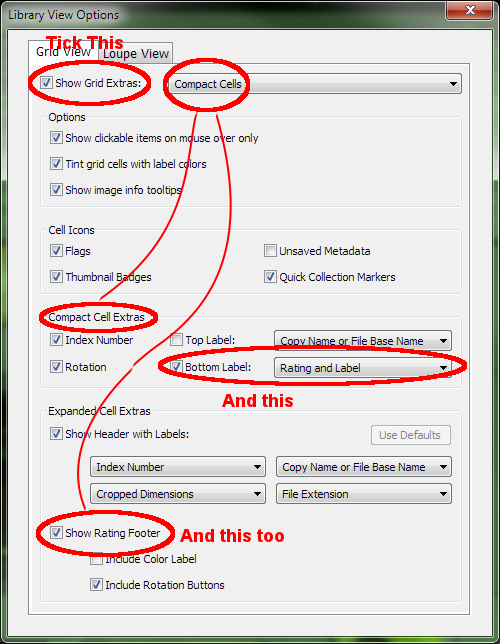
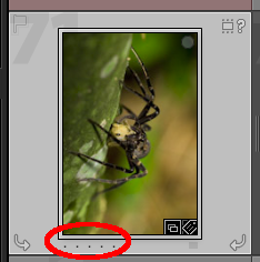
Don’t play with the flags for now unless you’ve already got some set, they can be dangerous! Let’s move swiftly on to the “Rating” section. This is simple too, and less dangerous; it’s a simple star-rating that you can apply to photos. Pick a photo or two and hover over them; you should see some small dots in the lower left. If you don’t, it’s because of the settings you’ve got applied to your view. Very briefly, use the “View->View Options” menu and make sure that you’ve got “Show Grid Extras” ticked, and that the “Rating and Label” option is selected and enabled under either “Compact Cell Extras” or “Expanded Cell Extras”, depending on the type of extras you have selected. OK, now exhale; one of the problems of Lightroom’s great flexibility is that it’s a real swine trying to describe where things are…
Hmm… where were we?
Ah yes, the ratings. The five easily-overlooked and possibly-not-there-at-all little dots underneath your photos:
If you hover over the photo, these dots should appear if they weren’t already visible. Go ahead and give ’em a poke… yep, they squeak too. You’ve just given one of your photos a star rating. You can change it by selecting any other rating – just click on a different dot or star – and remove it by clicking on the current rating. So, if you rated it two star, click on the second star and it will have no rating at all. Alternatively, you could just use the keyboard shortcuts which are “0” through “5” for no rating, and 1 through 5 star, which is both faster and less fiddly than using the mouse, and doesn’t depend on all those “view” settings. Should have mentioned that earlier, maybe.
OK, rate some other photos so you’ve got something to filter. Pick different ratings otherwise the results of the filter are going to be pretty disappointing.
And so, after a lengthy digression, back to the Attribute filter bar. Remember the stars in the middle of it?
Add a filter by clicking on one of the stars. It doesn’t matter which one; you’re not affecting any photos now, we’re back in the filter so all this is doing is changing which photos are visible. Pick different star ratings here and you should see your library grid change, showing more or less photos depending on how you rated them.
See the funny symbol to the left of the stars (≥)? If you remember your maths from school, that means “greater than or equal”. Actually it means that whether you remember it or not. Go ahead and poke that symbol… squeak… the menu that appears lets you change how this filter works, giving you the option for “equal”, “greater or equal” and “less or equal”. So, depending on what you’re after you can show all your really great photos (greater or equal, five stars), your really cruddy photos (less or equal, one star), some photos you might keep or not (equal, three stars)…
And last, but not least…
The colour filter. Or Label filter. Both phrases mean the same thing, and some places in Lightroom refer to “Color”, some to “Label” and some to “Color Label”. As if there weren’t enough grouping functions already, Lightroom gives you yet another – Colo(u)r labels. Unlike the flags and stars, the colour labels don’t really have any specific meaning; they’re just groups for whatever you want groups for. You can even rename the groups. By default they’re just called the name of the colour, but if you use the “Metadata->Color Label Set->Edit…” menu, you can change the names to anything you like. You can even go beyond this, adding as many custom labels as you like and then – yep, you guessed it – filtering on them. This opens up great possibilities, which I’ll cover in the Grouping Photos article.
For now though, let’s stick with the basic ones which are simply named for colours. As before, pick a few photos and give them labels; could be random, could be in groups, it’s entirely up to you. How do you do this?
Simple – although, as usual, Lightroom gives you loads of different ways of doing the same job. Just stick to whichever one you feel is best and keep in mind that there are others available.
- Right-click a photo, select “Color Label” in the pop-up menu, and then a label name.
- Use the keyboard shortcut, 6 through 9 for the first four labels. The fifth doesn’t have a keyboard shortcut. You’d think it would be “0”, but that’s already used for “0 stars”.
-

Painter Icon
Use the Painter. Wha’? Below the grid view you may (or may not) have the Painter tool visible. It looks like a little spray can. Select the painter, set ‘Label’, pick a label or type a custom label into the box and start clicking on photos. To un-paint, that is to remove the label you just added, hold down Alt and click the photo again. Before you stop, add one or two custom labels by typing something into the text box and then ‘painting’ that custom label onto a few photos. Try with two or three different custom labels. Finally to stop painting, click the empty circle where you picked up the spray-can from or click “Done”.

The Painter, with “Label” and “Green” selected.
- Use the “Color Label” tool. It’s possibly to the right of the Painter tool, and looks pretty similar. Why “possibly”? Because as usual, Lightroom might not be set to show it. Click the drop-down menu (yes, another squeakfor well-hidden interface goodies) and you’ll get a bunch of options for which tools you want to have available. It’s on the toolbar beneath the grid, on the right: Again, select “Color Label” if it’s not already selected and you should get those familiar five coloured squares appearing in your toolbar. You can now just highlight some photos and click in those squares to label as many photos as you want, with one click.

The Toolbar Menu drop-down
So, back to the filtering. Hopefully now you’ve got a colourful array of photos ready to be filtered. How? To the filter bar! To the right of the “star rating” filter is the label filter. Just choose which label or labels you want to be shown, and the grid updates immediately. You can choose more than one here, and the observant might have noticed that you get sevencolour boxes, not five, so what are the two extra ones for?
Seven Filter Options
If you hover your mouse over them, Lightroom will tell you! The first (white) one after the five normal ones is for “Custom” labels. Remember in the painter, you could add any text you liked as a label? If you did that, that was a custom label. Because Lightroom doesn’t know in advance how many custom labels you might add, it can’t show a little colour box. The last of the filter options (grey) is for “unlabeled”.
So, as a quick digression, what’s the use of custom labels if you can’t filter on them? Ah, but you can! Quickly, now; back to the Metadata filter, change one of the four (or three, or five, or however many you configured) lists so that it filters on “Label”, give Lightroom a few seconds thinking time and you get a list of all your labels, including the custom ones!
Nearly there now.

Filter Details
Just some details to clear up now. Details worth knowing though.
The “Kind” filter
Very simply, this filters on the type of photo. That should really be “type of asset” rather than “type of photo” though, because Lightroom is capable of working with video since version 3. The “Kind” filter lets you choose “Master photos” (i.e. originals which have a real file on disk somewhere), “Virtual Copies” (i.e. based on a real file on disk, but a different set of metadata or Develop Module settings which makes it appear as though it’s an independent second copy), or “Video” (i.e. Video).
The Padlock
Go ahead, poke it. It opens and closes, so it must do something. Now, I’d assume that this prevented you from accidentally changing filter options. I’d be wrong. Lightroom normally resets the filters when you move to a different folder or collection in the Library module. Rather annoying if you’ve just spent half an hour playing with filter settings (it gets much quicker once you’re used to it, honest). By closing the padlock, you tell Lightroom to leave the filter settings as they are when you move to a different folder or collection.
The Presets
There’s a better way than that though. Let’s say you’ve come up with a combination of filters which are really useful and you don’t want to lose them. Option 1 is to close the padlock and leave a sticky-note on the screen telling people never to change the filter. Option 2 is to create a preset.
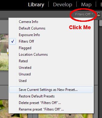
The Filter Presets Menu
Like many other Lightroom features, you can save presets or groups of settings, and then restore them later. Just to the left of the padlock there’s yet another drop-down menu. Squeak. At the top of the menu will probably be a bunch of presets with names like “Camera Info”, “Filters Off”, “Default Columns”. These are presets that Adobe provide with Lightroom, but the real power here is in creating your own. Take a minute or two to put together some bizarre combination of filters and then come back to this little drop-down menu.
The items at the bottom are really useful, even if you only use them rarely. Select “Save Current Settings as New Preset…” and you get a simple dialog where you can enter whatever name you like. Try to keep it fairly short, but not so short that it’s not meaningful. Go ahead and create a new preset, and then clear the filters. How? Well, in the best Lightroom tradition you should know quite a few ways by now.
- Unlock the padlock and go to another folder to clear all the filters
- Pick a different preset from the filter preset menu
- Manually change the filter to be different
- Select the “None” filter
Never fear, all your work is not lost! Back to the filter preset menu and your new preset, the one you just created, should be listed at the top along with the ones that Adobe give you as starters. Choose that from the list and all your filter settings are restored instantly.
The Other Filter Bar
The common filters are all repeated beneath the grid display too, just above the Film Strip. I won’t cover them all again, don’t worry! There’s no difference between selecting a filter here and selecting it using the filter bar at the top, except that the one at the top has many more options. If you went ahead and created a preset you can choose that preset from this second, smaller filter bar if you prefer so you could hide the main filter bar (View menu, remember?) and get a tiny bit more screen space for the photos.
And Finally
Phew, that was a long one! Trust me, it takes less time to use than it does to read about and once you’ve spent a little time learning what you can filter for, you’ll spend much less time in the future scrolling through pages of photos trying to find things. The filters hook into pretty much every aspect of the Library module, including text like captions and keywords, so with a little bit of care you can narrow tens of thousands of photos down to just the set you really need within a few seconds. If there’s one area of Lightroom which can really save you time – provided you’re willing to put in a little effort to classify your photos, which you’re probably doing already – this is it. Well, this and keyword hierarchies.
No rodents were harmed during the writing of this article. All squeaks are synthetic.




Leave a Reply
You must be logged in to post a comment.