Grouping Photos in the Library
Your library, if it’s anything like mine, is probably organised roughly into groups already using a folder structure. Maybe something along the lines of country or subject type, with folders for shoots or dates beneath that. All well and good, but what if you want to slice your photos up a different way? You can move things around into different folders, of course, but that’s a lot of work and having to do this every time you want to see a different group of photos is silly.
Lightroom as usual gives lots of ways of sorting this problem out. One is covered in excruciating detail in the article on Filtering, so I won’t go into much detail on that here. Another is covered in the Smart Collections article. However, even just using the Library module there are more ways of grouping your photos. Many, many more. This article is more about the possibilities of grouping rather than the details of what buttons to push.
Library Grouping Tools
Just in case, here’s a quick summary of the tools that the Library module provides to let you group or classify photos together.
Star Ratings
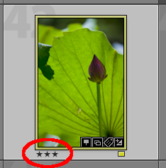
A Three Star photo
Firstly, the star ratings. These are pretty intuitive; you rate individual photos as having a star rating from one through five. Traditionally a five-star photo would be “better” – whatever that means to you – than a one-star photo. These are really easy to set in several ways. You can use the keyboard shortcuts which by default are “1” through to “5” for… wait for it… one star through five star respectively. “0” is for “no-star”, or unrated. Go ahead and try it, there are no permanent changes. Depending on how you have Lightroom configured, you will probably see some little star symbols appear in the Library module beneath the photo. You can click on those same stars to change the star rating, too. Yet another way is to use the toolbar which appears (probably!) beneath the library grid. If it’s not there, use the “View->Show Toolbar” menu item to show it. Once the toolbar is visible, look for the stars; if those aren’t there, you need to switch those on too.
Lightroom’s nothing if not configurable!
To get the stars on the toolbar, press the downwards arrow to the right and you’ll get a menu:

The toolbar options menu
On that menu, select “Rating” and the stars should now appear. While you’re here, make sure that the “Flagging” and “Color Label” controls are also switched on. We’ll be using these later, and speaking of which…
Flagging
Another type of classification is “flagging”. These have a different aim. Flagging is more about the review process, when you’re going through a set of photos that you’ve just imported. Setting a star rating is more about a long-term record of what you think of a particular photo; flagging is simpler – you mark as “Picked” (a white flag) or “Rejected” (a black flag). The “rejected” flag is really the key here because you can tell Lightroom to delete rejected photos from disk. If you’ve not come across this feature before it’s hidden away at the bottom of the “Photo” menu called “Delete rejected photos”. Don’t try this unless you really do have some photos you want to get rid of! Once again, the keyboard shortcuts are worth learning – “P” for Picked and “X” for Rejected.
Color Labels
Colour labels are meaningless. So why did Adobe bother adding them? Ah, but being meaningless is a good thing. They don’t have any specific meaning as far as Lightroom is concerned, which means you can use them for anything you like. A star rating is pretty clear as an indicator of quality; flagging “pick” or “reject” is pretty clear as… well… picked or rejected, really, but colour labels are completely open. Because of that I can’t tell you what they’re for, but I can make some suggestions. There will be many more ideas out there for using these, and feel free to come up with your own.
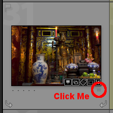
The colour label control
Assigning a colour label is as easy as flagging or starring; you can use the toolbar beneath the Library grid, or the keyboard shortcuts (“6” through “9”), or the “Photo->Set Color Label” menu in all of it’s mis-spelled glory, or even a tiny, near-invisible colour swatch on the photo itself if you have a sharp mouse hand. It’s a tiny grey square beneath the photo and if you click on it, you get a menu which lets you choose the label. It’s really much easier to use the keyboard, but each to their own.
Collections
These are really a different kettle of fish; a collection is just like a folder, except that it only contains references to photos rather than photos themselves. In other words, when you add a photo to a collection you’re not making a copy of it or moving it around on disk, you’re just telling Lightroom to keep tabs on it. Usually you would add more than one photo to a collection, otherwise it’d be a pretty pointless collection, but the key thing is that you can give the collection any name you like. You could have a collection called “Photos I Like”, one called “Red Fish”, one for “Cute Cats”, whatever you want. Each collection can hold photos from anywhere in your library, and you can add one photo to as many collections as you want.
The catch is that you need to add the photos yourself. That’s not a huge problem, but it is manual work and I like to try and avoid that wherever possible! Collections are found underneath the “Folders” section on the left of the Library module. Click the “+” icon to the right of the “Collections” header to add a new collection, and adding photos is as easy as dragging them in, just as if it were a folder.
Smart Collections
These are covered in more detail elsewhere, but as a quick reminder, they work more or less like collections do except that instead of hand-picking photos and adding them to a Collection, you tell Lightroom how to find the photos you’re interested in and it goes off and does the legwork for you. This can be a simple rule like “Three star or higher”, or something as complex as “Photos taken last year on a specific camera which don’t have a certain keyword but do have GPS data”. The result is the same – you get something that works just like a normal folder but can contain any photo regardless of where it actually exists on disk. The bonus with Smart Collections is that they update themselves; if you add new photos to your library which are three star or higher, or were taken last year on a specific camera and have GPS data but don’t have a specific keyword, they will appear in the correct Smart Collection without any effort on your part whatsoever.
So much for the brief introduction.
As I said, this is more about the “why” of grouping rather than the “how”, so now that you know more or less how to assign labels, ratings and flags, let’s put them to some good use.
The point of classifying photos is to be able to find them later. There’s no point in having a massive library of great photos if you can’t find what you’re looking for. Sure you’ve got them organised in folders on disk (I hope?) and that does help, but as I said earlier it’s limited to a single way of searching, and that single way was defined when you decided how you were going to organise your folders. By applying a little organisation when you first import your photos, you can make it much easier to find just the right ones later even though you don’t know right now what you’re going to be looking for.
So, let’s start with flagging. As I described earlier, flagging marks a photo as “wanted” or “unwanted”. So much for that. Of course, there’s no rule that you have to use those meanings; remember, you can filter or search on any of these grouping features so if you wanted the two “flagged” statuses to mean “ready to use” and “not ready to use”, that’s entirely up to you. That does kind of go against what they’re intended for, but who cares if that’s what you want to use them for?
Star ratings are slightly more flexible than the flags, simply because there’s five possible settings – six if you include “not rated”. Provided you’re consistent in your ratings, they can be a very useful way of finding your best photos.
However, let’s be mildly heretical here. What do those stars mean to Lightroom? Not a jot. They can be taken to mean absolutely anything you like. How about this: instead of showing your personal opinion of the photos in your library, what about adding one star to a photo every time you sell a copy? Not to keep track of sales, but as a general indicator that some photos are more popular than others. OK, so you’d top out at five sales, but you’d still have a general indicator of which photos ‘work’ and which don’t. No, I don’t do it this way and no, I’m not particularly recommending it. Just an example of how you might get Lightroom to work your way, instead of the other way round.
Labels again
The real power is in the Colour Labels. They seem fairly arbitrary, don’t they? What does it mean if a photo is marked as “Green” or “Yellow”? Not much, that’s what. How about we add some meaning to the colours, then?
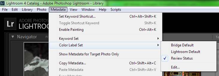
Color Label menu
Let’s start simple. Go to the “Metadata” menu, then “Color Label Set”. Now choose “Review Status” from the sub-menu. What do we have here? Nothing seems to have happened… until you hover the mouse over the colour swatches in the toolbar beneath the grid. The one you switched on earlier. Instead of saying ‘Set label to “Green”‘, the tooltip now says ‘Set label to “Good to use”‘. Click on the little “label” icon on a photo and you get the same drop-down menu that you did before, except that now the text is all different.
Nothing’s changed as far as the photos are concerned, but you’ve changed the meanings of the colour labels to be something that’s actually useful. Now, the attention-payers amongst you are probably saying “yeah, yeah, so what? I can already group photos like that by using collections”.
You’re right, you can.
What you can’t do with a collection is show immediately in the Library grid which collections it’s in. Go ahead and try it, assign a colour label to a photo and in the Library, you should see a difference. It might be a thin border, or it might be a full-colour surround, but it’s pretty clear that the photo has been labelled.
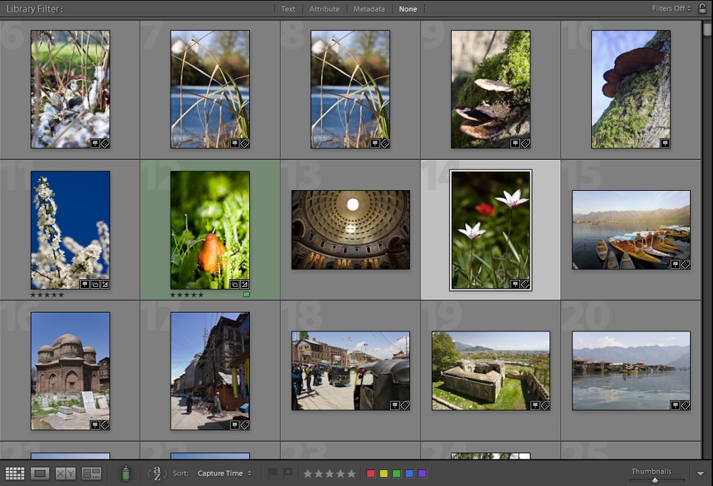
So which photo’s flagged “good to use”?
Next benefit: To add a photo to a collection takes a few seconds to do. Okay so there are several ways of doing it, but each involves a few different steps even if they are very short, simple steps. Pick another photo and press “8” on the keyboard; instantly, it’s labelled as “Good to use”. If you’re a real die-hard mousie you can still do it quickly using the little, hidden drop-down menu beneath the photo. However, like the song says, give keys a chance. If you’re labelling a new import with 500 or so photos in it, you’re going to be pressing the same few buttons on the keyboard over and over again. You have less choices than fingers, so you’ll quickly move from the “hunt and stab” to a subconscious rhythm that will get you through those 500 photos much, much faster than if you were using the mouse.
Next benefit: You can still have your collections! Let’s go for smart collections though – we’re all about “smarter, not harder”, after all. I won’t repeat the full detail of the Smart Collections article here, but in brief, find the “Collections” section on the left-hand side of your display and click the “+” icon. Choose “Create Smart Collection” from the drop-down menu, and you get this:

A shiny new Smart Collection
Set up your new Smart Collection to look like this and click “Create”. It should now appear in the list of Collections. Select it, and check that the photos you tagged as “Good to Use”, the label formerly known as “Green”, are all shown. Go back to another folder and label some more photos as “Good to Use”; come back to the Smart Collection and there they are.
Custom Labels
This is all fine, but what if you don’t see any practical use for labels named for colours or named for review status? Not a problem. Go back to the Metadata->Color Label Set menu, but this time pick “Edit”. You should see the definitions for the “Review Status” set. Let’s change these to show landscape types. That’s a totally arbitrary choice, if you want to use something different that’s fine.
Fill the dialog out like this, but don’t click “Change” yet:
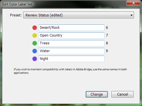
Alternative colour labels
Let’s say you do mainly landscape photography and it’s important that you can quickly find photos where the main feature is one of the items in this list. If you’re about portrait or studio photography, try a list like “Kids; Couples; Men; Women; Groups”.
Now, before you click “Change”, note that the drop-down list at the top says “Review Status (edited)”. Remember we were using the “Review Status” label set, so Lightroom now thinks that we wanted to just change those labels. Well, we could, but it would be better to have a meaningful name for this set of labels. Click that drop-down and choose “Save current settings as new preset”. This gives you the option to name the new preset, so pick something that describes whatever set of labels you entered and now, on the little dialog which asks for the preset name, click “Create”. Finally click “Change” to dismiss the dialog and start using your new, personalised, set of labels.
Hmm. Something fishy, here.
Hey, where did my green “Good to use” photos go? If you still had them displayed in the grid, they no longer have the green surround. Check out the Smart Collection you created and it’s empty. What gives?
Well, it turns out that the labels are sticky labels. The colour is just… er… a label. For the label. Confused? That’s OK, it gets most people at first but once you get your head round it, it turns out to be really useful. Let’s take a step back and look at what actually happened.
You set a label, a green one, on a few photos. Those showed up exactly as you’d expect in a Smart Collection which was set to show “green” labelled photos. What you actually did was to label those photos with “Good to Use”. Yes, the label you assigned was really a bit of text; the green display was just a visual indicator. When you created a new label preset, you told Lightroom that green no longer meant “Good to Use”, but something else – “Trees” if you followed the example above. So, in the Library module, your labelled photos are no longer shown with a green border because green now means “Trees”, and they were labelled with “Good to Use”.
Your original labels are still there, though! Let’s prove it by creating a new Smart Collection. Just as before, find the “Collections” header in the left-hand panel and click the “+” icon then select “Create Smart Collection”. This time, set it up like this:

Yet another Smart Collection
See the difference? This one is based on label text, not label color. Create this, and your “Good to Use” labelled photos should all reappear inside this Smart Collection.
What does this mean for day-to-day use, then? Well, one option is that it’s all far too much detail and you sweep it swiftly under the mousemat! On the other hand, it gives the option of having that extremely intuitive visual indicator of a photo’s characteristic – the colour outline in the grid display – and, more than that, having several sets of these. Say you do both landscape-type and studio-type photography. With what you’ve learned about labels, you can create two label sets and, depending on what you’re working on, use one set or the other. Anything that’s not in the set you’re currently working with appears in the grid as dull grey, while anything that is in the working label set is highlighted in colour.
Try it – switch back to the “Review Status” label set and your tree photos will lose the green border and the “Good to Use” photos will regain it, and the contents of the “Green Label” Smart Collection will change too.
So how do I make best use of this?
I really couldn’t say. Only you will know what groups of photos you might use. The terrain types and portrait groupings I suggested are a good place to start, but don’t stick to those. Try to think of any area where you often review large collections of photos to find ones with certain characteristics. Yes, you can group photos by keywords and folders and collections, but none of those give you the same ability to see instantly which group a particular photo belongs to. One thing to bear in mind is that a photo can only have one label at a time, and maybe this is a problem, but it can also be a benefit for certain types of grouping.
The journey doesn’t end there though; once you’ve started properly grouping things, it’s time to think about the other side of the coin – using those groups to filter them.
Good luck in thinking of with new ways to use labels to group your photos. I’ll be most interested to hear what you come up with!